Tuesday, May 13, 2014

2110 Gallery: Art de la Raza

The 2110 Gallery Second Saturday Art Walk, 5/10/14

          For the Second Saturday Art Walk, the 2110 Gallery held a multi-artist exhibition for Latino(a) artists.  The show features artworks that touch on tradition and culture, combined with contemporary elements and the expressions of each individual artist.  The exhibition, titled Art de la Raza, showcased mostly paintings done in many different styles but there were some sculptures in the show.  When I walked in, there were brownies and other pastries and some champagne being served for the opening of the exhibition.  After spending time, looking at the works in the gallery, I went back and noticed that the building extends in the back to studio spaces for other artists.

Raphael Delgado talks about his art
Raphael Delgado, Voyage, 2013
          Raphael Delgado's art is diverse; he explores painting and collage.  In his piece titled Head Study, he explores shapes within a human portrait.  It reminds me of cubism, but Delgado does not abstract the form of the man into shapes but simply fits the shapes onto the man, almost as if he is made of it.  Delgado's collage works are more intriguing to me not only because of the composition and arrangement of the pieces, but because of his process in creating them.  I got a chance to talk to the artist himself and he told me his collage works are made up of pieces of old artwork.  He takes from work he doesn't use and cuts them up and creates an entirely new piece made up of remnants of old work.  The idea of using old work to create a new art piece was an interesting concept to me.  He re-contextualizes them into something new so not only is it visually different from the old work, it now takes on new form and meaning.  He told the audience he wanted to get them thinking about the lines and intersecting shapes and to see what they can find within the artwork.  When I look into Delgado's Head Study, I see his interest in line and shape within a form.  I feel like it is almost a geometric piece because of all the different shapes he creates through the use of line.  In Voyage I see line and shape.  The little designs he creates from lines are thought provoking.  Delgado explores the lines and creates different forms and designs.  The limited color palette and the placement of colors suggests the artist wants his viewers to focus on these lines.

Raphael Delgado, Head Study, 2014

Maceo Montoya, La inmensidad I, 2009

Maceo Montoya, Viejita in Target, 2009
          Maceo Montoya's works are mostly large and his focus seems to be on the landscape and atmosphere.  His works are pretty realistic and gives his pieces a clear color scheme.  In La inmensidad I, features a neighborhood.  A lone child rides his tricycle and a boy kicks a soccer ball.  There is a silhouette of a man standing in the background.  The name implies a Latino context, so I thought perhaps this is a neighborhood inhabited mostly by Latin Americans?  Although there is a lot going on in the foreground, there is equal attention being spent up in the sky.  The work translated means "the immensity"; is it addressing the immense space of the sky above?  Or does it speak of the immense poverty of Latinos living in the United States or Latin America?  For La inmensidad I, a cool color scheme is used and the people all appear to be lonely and although the kids are playing, they are playing alone.  In Viejita in Target, a warm tone is applied.  I still pick up a sense of loneliness: the little old lady is alone and the space around her is vast and even the shelves are far from her.  I get the feeling that Montoya is trying to depict loneliness in social settings.


Aida Lizalde, Meat, 2013

Aida Lizalde, Newborn, 2012
          Aida Lizalde explores her meaning in both acrylic paintings and ceramic sculptures.  Her paintings focus in on the main subject unlike Maceo Montoya's work above.  She tells the audience that her paintings are focused on birth, childhood and womanhood.  In her painting Newborn, it is clear that the painting is about birth.  It features a baby, with an umbilical cord still attached.  Her body is vertical, and her face scrunched up in discontent.  Lizalde made the decision to have the female genitals exposed and have it be the body parts closest to the viewer.  I wonder if the artist is wanting to display birth, childhood and womanhood all in one painting.  Giving birth is an experience unique to women, so Newborn expresses both womanhood and birth.  Soon, the baby will become a child, and then eventually grow into a woman, completing the cycle of birth to childhood and to womanhood.  Lizalde's Meat is a more ambiguous.  There is no clear meaning, only what the audience can glean from it.  I thought it alluded to the female because the meat is pink, a color associated with femininity.  Meat can be referring to the objectification of the female body, reducing her to a piece of meat.


Sunday, May 11, 2014

U-Nite

          April 10th 2014 was the third annual U-Nite at the Crocker Art Museum in Sacramento.  U-Nite is a celebration of the arts that showcases original works from the nationally celebrated faculty of Sac State's College of the Arts and Letters.  The event was created to unite everyone together to celebrate the arts through dancing, music, performances, photography, film and other forms of art. I have never heard of the U-Nite, and was curious to see what it was all about.  I brought my mom, MaryAnn Suan, along with me for the event.
The band, Rogue Scholars, exits the court.
          When I walked in, there was a band playing and the museum was crowded with people.  The atmosphere was very festive.  I picked up a pamphlet to see what events were taking place.  as I walked into the Friedman Court area, the tables and chairs had all been moved to make room for a large stage where a band called Rogue Scholars was performing. In the courtyard behind the glass windows was some strange see-through inflatable structure.  There were people holding a bunch of balloons.  I wanted to check out the installation but I didn't wanted to miss some of the events scheduled for U-Nite.  One event caught my eye: comic art presentation by Mario Esitoko held in the auditorium.

Mario Estioko introduces himself
         Mario Estioko is an associate professor teaching graphic design at Sacramento State University.  His hobby is making comics and he states that this art usually gets no respect or recognition. Estioko and his friends would do "push nights", a time where they would doodle until 2 to 3 in the morning.  One night, his friend came up with a character of a man with one huge pectoral.  Estioko expanded on his friend's design and that was when his comic book hero, Dent, was born.  Estioko also created the city called Sactown, a cross between Detroit and Sacramento.  This will be Mario Estioko's first reading of his comic titled Peck: The Man Without Neck.  The comic is about how an old man named Cornelius Bacon and his teddy bear Billy Trudare found a man named Dent in the Sactown dump who had lost an arm and his memories.  Bacon and Billy nurse Dent back to health, and teach him Gar Bag Do, the way of the can.  Under the training of Cornelius Bacon, Dent will become a freakish crime fighter by night and will try to take back Sactown from the villains that have plagued the city with greed and corruption.  Estioko's presentation was very unique; he prepared a slide show of his comic, frame by frame and provided the diverse voices for his characters and even included some sound effects.  His characters and story were unique and I like that he took inspiration from Sacramento city.  I enjoyed his presentation and was impressed with his voice acting skills.

slide show from Maria Jaoudi's art presentation


       After the comic art presentation we walked over to the Works on Paper Study Center for the next event: an art presentation by Maria Jaoudi.  The room was on the second floor of the museum in a small room packed with people; most looked to be students.  The presentation was titled Spirit and Nature: The Paintings of Maria Jaoudi.  Jaoudi is a professor at Sacramento State University who teaches humanities and religious studies.  She is a published poet and her paintings have had many exhibitions in France.  The exhibition is titled Spirit and Nature or Inner and Outer Space. She works in the mediums acrylic, oils, and enamel.  The first ten minutes was just a slideshow presentation of Maria Jaoudi's many works.  Classical music was playing in the background.  Her works are very colorful and usually there are no recognizable forms, though sometimes you can make out a form of an animal or human.  Each slide had about seven seconds on the screen, I thought it was too short of a time to really appreciate the art.  Jaoudi painted at a young age, earned a BA and lived in a cabin in an area where not many people lived.  She described it as living in a natural setting in silence.  Whenever she paints, she needs large blocks of time because these paintings happen all at once.  Uncomfortable with untitled pieces, Jaoudi puts a lot of time and effort into the title itself.  She takes a holistic approach to her art. I asked if her paintings are planned and she replies that when she paints, she has the color in mind and everything else is formed along the way. 


          I enjoyed looking at Maria Jaoudi's work, though I wish the slides were longer or that she had some paintings there to look at.  What the presentation did do was let me see a large body of her works, and get an idea of Jaoudi's style and approach to her paintings.  Her paintings seemed to be entirely focused on color, and in this way they felt spiritual.


          When we left the room, we heard drums playing.  People  were gathering around the second floor balcony.  We found a spot to stop and watch the performance taking place in the Friedman Court below.  A group of people were playing drums, one was standing and playing.  It was the live drumming performance by Tyehimba Kokayi.  A girl was on stage, dancing to the music.  To the side were people dressed in masks and crazy costumes dancing.  My mom commented "I don't get it".  To me, there was nothing to get.  It was music and dancing performed in celebration of all that have gathered here to appreciate art.  The music was not traditional western style; it is from a different culture by people of African ethnicity who wish to share their music.  The dances were spontaneous and free, I liked that there were people getting into the music.  Like art, music and dance aren't just one thing.  I embrace the diversity of art from traditional impressionist style to more contemporary forms like installations and think it is a wonderful thing to see the variations.  It may not suit everyone's taste and I think that is okay too.  We all like what we like after all.

girl on stage dancing to live drumming by Tyehimba Kokayi

       U-Nite was a fun experience, filled with many presentations and performances in celebration of the arts.  There was so much going on that I could not make every event, but I loved the feeling of liveliness and celebration.  I will definitely be checking out U-Nite again next year, hopefully next time I will have more time to check out the different events.


Saturday, May 10, 2014

South Korean Artist: Jung Won Chul Lecture

Jung Won Chul, Face to Face, 2004
          Jung Won Chul is one of the South Korean artists showing in the University Library's exhibition: The Land and the People-Contemporary Korean Printmaking.  He is the artist that made the huge portrait prints titled Face to Face that hung from the ceiling.  I was excited to learn from this particular artist because I was blown away by this art piece and I really wanted to know about his process in making these prints.  Additionally, I love to hear from foreign artists because I will also get a rare opportunity to learn something about their country like their traditions, culture, and their politics.  As someone who has never left the country or even left the state, foreign cultures have always fascinated me.  Jung Won Chul was introduced by professor and artist Ian Harvey and Koo Kyung Sook professor of art emeritus, Chungnam National University.  They were very grateful to have him come to the U.S. to exhibit his works.  Jung Won Chul knew some English but wasn't fluent and so he had a translator alongside him during the lecture.

Jung Won Chul 
            Jung Won Chul was interested in the longitude and latitude of Sacramento.  By this he means the city's location, in the middle of the state of California.  I thought this was a very different observation.  I don't think much about the location of Sacramento, and I don't think many others do.  In a Korean context, latitude and longitude mean a lot to him.  He explains South Korea as a peninsula, kind of like an island being isolated.  South Korea had become isolated from the North side, coincidentally Sacramento is very important to him.  This is because in Korea, Jung Won Chul feels held back physically, spiritually, and mentally because he is not able to cross the 38th parallel.  The 38th parallel refers to the Korean Demilitarized Zone (DMZ), a dividing line set in Korea in 1896 that created the two independent nations of North and South Korea.  Jung Won Chul wanted to create a work that shows the importance of freedom.
Jung Won Chul and translator

          Jung Won Chul has been able to cross the furthest North, but there is a certain point he cannot cross.  For 50 cents you can look at the other half of the country you cannot cross.  There is a museum that shows the mines and bombs laid in the ground from North and South Korea.  Chul explains that even though the fighting has stopped, the war has not ended.  What was signed at the "end" of the Korean war was a cease fire, not a peace treaty.  In Korea there is a sign that symbolizes this division of the North and South.  For his next artwork, Jung Won Chul wanted to come up with what would symbolize Sacramento's 38.5 degree to reference the 38th parallel line of division set in Korea.  He wanted a person to symbolize this and it could be anyone, but Chul wanted someone he knew personally.  He chose Jerry Walburg, an artist from the TB9 lecture I attended earlier: http://suanpond.blogspot.com/2014/03/remembering-tb9.html.  He was asked later about how he encountered Jerry Walburg and Chul answered that Walburg once showed him tools that he needed to make prints.

             Chul states that no one has entered the DMZ in 60 years, so it is the best place to find ecology.  He then says that in fact people do enter secretly, usually spies from North Korea and South Korea.  They burn the forest to find each other.

Jung Won Chul setting up his workspace
Jung Won Chul demonstrates his process of making a linocut print
          After the lecture, Jung Won Chul showed the audience his process in making his prints.  He explains that first he draws a background on a linoleum sheet.  You have to draw the image in reverse, like a mirror image when you want to make a print.  This is because unlike drawings or painting, the resulting image of a print will be flipped once you stamp the woodblock or linoleum sheet onto a paper.  Chul used to hand-draw a rough draft, but now he uses computer technology to reverse his desired image and traces the projected image onto the linoleum sheet.

Chul's tools up close
cutting off a piece of linoleum
           Jung Won Chul uses two different tools to carve into the linoleum sheet: the traditional cutting knife and a rotary power tool which he said was a dental tool.  In actuality it was some sort of high powered dental polishing tool.  I don't know why he called it a rotary power tool, maybe because it functions similar to one or he didn't want to confuse too many people.  He likens cutting a linoleum or wood block to making a relief sculpture.  You have to decide whether something will be in the foreground or background.  You have to carve what will not be inked.  To get an idea about what it looks like before printing, he suggests to color everything on the linoleum sheet with a black pencil.  Chul says that his process is not much different than our works in that if he doesn't like something he will cut it off.  He adds jokingly that audiences will not know he made a mistake anyway.


dental tool up close
         I was very interested about the dental tool he used and why and where he came up with the idea of using it as an artistic tool.  When I asked him about it, he didn't answer where he came up with the idea I'm assuming because of a language barrier, but he told me why he used it.  Jung Won Chul explained to me that the dental tool is more powerful and has precise cuts and it is quicker.  It is also easier on his back since with traditional cutting he has to lay the work flat on a table and bend over to make his cuts (see pictures above).  With the dental tool however, he can stick it on the wall so he doesn't need to bend over (see video).  Due to the linoleum sheet being up on the wall, he can also stand back and take at his progress and see how he is doing.  Also, his movement with his arms are more natural and free when it is on the wall.  To create a difference in tones, Chul uses different sized needles.  The thicker needles go faster.  He wanted to print the landscape first in color and then print Jerry Walburg in black and white.  Jung Won Chul said that he would work for the next three days and leave the finished print here in Sacramento.

The linocut after the lecture and demonstration

linocut up close


          This lecture was one of the most interesting and informational lectures I have been to.  Not only did I learn a new artistic process of making linocut prints, I also learned a bit about the country the artist came from.  I never thought about how a divided country can affect its people, for Chul it has become something he explored through his art.  In the United States, we are free to roam wherever we want.  As a Korean, there is only so far you can go in your own country.  In this context, it can feel limiting if you are used to being able to go wherever you wanted.  Despite the language barrier, everything was explained pretty smoothly.  Jung Won Chul was very comfortable giving his lecture and he cracked a couple jokes to lighten the mood, some in English so he has some understanding of the language.  Overall, it was an enjoyable, informational lecture and I am so glad that Ian Harvey and Koo Kyung Sook were able to have him showcase his works.

Artist Jung Won Chul and Catherine Suan (me)

Thursday, May 8, 2014

An Intimate Look into the Lives of South Africans


Public Intimacy: Art and Other Ordinary acts in South Africa, Yerba Buena Center, 2014
Gabriel Perez, my boyfriend, stands at the right
          I have been on trips to art museums in San Francisco like the De Young, the Asian Art Museum and the San Francisco Museum of Contemporary Art (SFMOMA), but I have never been to the Yerba Buena Center for the Arts.  After having lunch and visiting galleries along the way, I discovered that the Yerba Buena Center is right across from the SFMOMA.


David Goldblatt, Dr. Paul, Hofmeyr. Eastern Cape. 4 2006, 2006, printed 2013
          Public Intimacy: Art and Other Ordinary Acts in South Africa is an exhibition examining the everyday lives of South Africans in the country and the poetics and politics of the "ordinary act".  Instead of spotlighting the dramatic apartheid history in which the country is largely known for, the show's intent is to put on display a more subtle and private part of South African life that has been generally overlooked, but no less important.  There are 25 contemporary artists featured in the show that delve into different aspects of post-apartheid South African life using a wide range of mediums.  Each individual work has much purpose behind them and the artists have gone to great lengths to convey their meaning.  The setup of the exhibition was very well done; there were rooms in which some artists were given to spotlight their works and there were other works along the walls or floors that guided you down into every corner of the space.  Artists that explored similar subjects like landscape photography or video installation were stationed near eachother.  Other artworks like Nicholas Hlobo's sculptures and Kemang Wa Lehulere's installation occupy the same space interrupt the flow of photography from the previous rooms.
Santu Mofokeng, (Ancestors) Graves series, 1992-ongoing, printed 2013
         One of the memorable works for me was the series of landscape photography created by artists David Goldblatt and Santu Mofokeng.  They were memorable to me because the photographs were not only about the landscapes, but about South African society, politics, life and spirituality.  David Goldblatt's Dr. Paul, Hofmeyr. Eastern Cape. 4 2006, is a series of three inkjet prints, featuring a quiet, barren, old looking building and landscape in three different perspectives.  Goldblatt uses three perspective photos to tell a story about the place and its inhabitants.  A small piece of the lives of these unseen residents are put on display.  Though the people are not seen, their presence is established through the buildings, the telephone poles and most importantly the advertisement sign that the artist purposely included in all three photographs.  For me, the advertisement sign suggests there are people in the area, as there would be no business without people.  Goldblatt shares the space with Santu Mofokeng, who produces photographs of landscapes charged with a traumatic past.  Mofokeng uses a series of photographs in his (Ancestors) Graves series to illustrate the desecration of spiritual land and the uprooting of graves, which in turn puts on display the indifference of the mining corporations and individuals involved in the exhuming of the dead.  Both artists depict similar scenes of a seemingly desolate landscape, but they are  intimate windows into the lives of South Africans both past and present.

Nicholas Hlobo, Umphanda ongazaliyo, 2008

Nicholas Hlobo, Isisele, 2010
           As I walk into the next room, the trend of 2-dimensional work is broken by a black mass lying on the floor.  Next to it is another black sculpture titled Isisele, which looks to be coming out from a hole in the wall.  The sculpture eventually spreads out into vein-like structures onto the wall and a black substance spills onto the floor from the hole.  On closer inspection, the black mass is made of rubber and stitched onto it are colored ribbons. Nicholas Hlobo's Isisele looks to be an open wound that oozes out a liquid substance.  Another sculpture titled Umphanda ongazalio is made of similar materials installed in a separate room.  The sculpture hangs suspended in the air and resembles a large organ, with a small tube attached to the wall that suggests it grows from the building.  The artist, Nicholas Hlobo uses traditional medium like stitching and weaving and contemporary, innovative materials like leather, rubber, zippers etc for his sculptural works.  Hlobo draws from his Xhosa roots and creates work that question gender, sexuality, race and ethnicity.  The tough, black rubber taken from boots or thick tires serve as a metaphor for masculinity while the colored ribbons that are stitched and weaved into the rubber, suggest femininity.  The stitching and weaving is a traditionally female craft in South African culture and the black of the rubber could be a read as black skin.  With this in mind, we can look to the artist who is a black South African gay man.  To me, these forms are sculptural manifestations of the artist himself.  In this way, the audience can get an intimate look at the artist as he reflects upon his own identity.

William Kentridge, Drawing for the film Tide Table: Officers with Binoculars, 2003


William Kentridge, Drawing for the film Tide Table: Beach Hotel at Night, 2003
           As I move forward into the exhibition, I spot a familiar work.  It is a framed charcoal drawing from a scene in the charcoal animation called Tide Table: Officers with Binoculars.  The artist, William Kentridge, uses an animation process in which he films his drawings, erases and draws the next sequence and then photographs it again.  The end product is an animation that leaves traces of the older sequences, which is the consequence of using the same paper for a scene and using charcoal, a medium that doesn't erase well.  However, Kentridge employs this style of animation purposely: The traces left behind from the older sequences intensifies the movement, and suggests the idea of reminisces and traces of the past, a theme that Kentridge visits in his animations.  In the film installation Tide Table, the audience is taken to a post apartheid setting.  A white man sits on the beach in a business suit, reading a newspaper.  His name is Soho Eckstein, he is modeled after the artist's paternal grandfather and after himself as well.  Soho watches the youth play, he remains a third party observer.  The fact that Soho is modeled after Kentridge's  grandfather and looks much like the artist, we can look at Soho as a metaphor for Kentridge's personal experience during and after the apartheid in South Africa.  The ebb and flow of the waves that Kentridge focuses on can be a metaphor for the many social and political changes in South Africa after the fall of apartheid.

Terry Kurgan, Hotel Yeoville, 2013
Kemang Wa Lehulere, The Grass is Always Greener on the Other Side, 2014
Mikhael  Subotzky and Patrick Waterhouse, Cleaning the Core, Ponte City, Johannesberg, 2008
         Public Intimacy: Art and Other Ordinary Acts in South Africa is an amazing exhibition that showcases a collection of artwork by varied artists that put onto display the every day lives of South Africans, mostly looking beyond its apartheid history.  I found that the show was well executed in the fact that it kept me interested as it eased me into the rooms.  You can tell that each artist had much to tell the audience and I learned so much about South Africa.  I didn't even know about its apartheid history (I feel so ignorant for not knowing).  I feel like the the exhibition was telling a story about South Africans, an intimate story that focused more about the every day citizen and their experiences based on their identity whether they be black, white, gay, lesbian, male or female.  It also told me a story about the land itself, like the plundering of resources in South Africa by foreign corporations and the effects on the environment and its people.  I enjoyed the exhibition so much; I'd  want to see it again because I know there will be more to the show that I missed and more to learn as well.
Catherine Suan admiring the installation piece of Kemang Wa Lehulere

Monday, May 5, 2014

The Playful Interaction: God's Eye Exhibition

God's Eye exhibition, University Union Gallery, 2014
Exhibition date: April 1- April 24, 2014
          I stumbled upon a gallery as I was exploring the second floor of the University Union at Sacramento State University and it happened to be  holding a well advertised exhibition, the God's Eye by Troy Mighty.  The University Union Gallery had artwork occupying each side of the walkway before opening up to the main room.  The God's Eye exhibition was unique in terms of style, installation, and how it interacted with the audience. Most of the works are small in size, but carefully crafted and professionally framed.  The show exuded a playful and warm atmosphere which I enjoyed and found refreshing.

You Look Up So Good,
spray paint and acrylic on canvas, 2014
          As I entered the gallery, the first thing I saw was a small square canvas hanging from the ceiling.  Upon closer inspection the design appeared to be similar to a doily and the bright colors were reminiscent of psychedelic art.  Looking at the title that hung next to it, I smiled, nearly laughing!  The title read You Look Up So Good, as if the art was conscious of its audience.  Even though the piece would be more easily viewed if hung traditionally, the artist's purpose seemed to aim toward amusing his audience and to have them speculate why he chose to display it so high up - a question that is answered upon looking at the title.

In The Sky A Thunderous Glory, And Below Is Where We Grow, eight acrylic paintings on fiberboard 2012
From The Series: "Living In Our Heads", watercolor and pen on paper, 2014


         To the right was a rather large piece made up of eight acrylic paintings on fiberboard and some other mediums.  It was titled In The Sky A Thunderous Glory And Below Is Where We Grow.  The installation had a cartoon deity flying above and below on the grass is a cartoon snail.  Although I don't fully understand the meaning of the piece, I still enjoyed it and loved the fact the artist was approaching artwork in an unconventional manner.

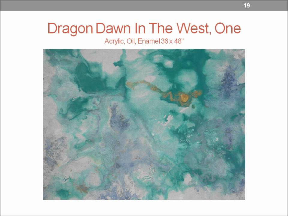
Planned and Unplanned Connections, Pencil and Paper, 2012
and God's Eyes, sticks, yarn and good intentions
          As I entered the main room I noticed a rope was looped around the ceiling and part of it hung down to the floor.  I became aware of the space above me, which is not a common experience in galleries.  As I looked at the small art pieces around the gallery, I noticed there were kite-like sculptures made up of what looked to be yarn and sticks suspended below some of the works.  After reading the title and description for these sculptures, I learned they were also made of "good intentions".  I found these sculptures, titled "God's Eyes", to be attractive in their simplicity and inventive in the way they were installed.  One would think they should be hung separate from the art so they wouldn't distract the audience but for me this was not the case.  I'd argue that they help complement the art because they fill up some of the empty wall space and the diamond shapes point toward the pieces, maintaining the visual flow of movement.
       

Eternal Atonement, acrylic and pencil on skateboard, 2009
          A piece painted on a skateboard, titled Eternal Atonement, features a human-like female and male with faces covered with what looks to be hair standing at the summit of a round mountain.  We see here the artist exploring different ways to display art while using traditional medium of acrylic and colored pencil.  It is not uncommon to see art printed on skateboards, but seeing it displayed in a gallery setting with the actual medium applied to it was a new experience for me.

No Title "You Make The Title!",  acrylic on masonite, 2010

           One art piece had no title and instead the sign below read "You Make The Title!", with a clipboard attached below.  The art style, color palette, and forms were simple and flat but it was well executed with clean lines and precision.  The flat colors that Troy Mighty employs complements his art style.  I liked seeing that the artist was asking the audience to name a piece.  Sadly I could not come up with a title at the time.

Me & Harold & William Playing Ball, 1982, pencil and pen on paper, 2012
            The God's Eye exhibition features paintings and drawings of humans, animals and odd creatures rendered in a cartoon style.  The flatness of color and simple compositions work for the style that Troy Mighty uses.  There is a charm to these art pieces that come from the simplicity of the composition, color and clean tight lines.  The God's Eyes sculptures added a magic touch to the show without distracting from the art. The artwork was nicely framed and the exhibition was installed well.    The overall mood of the show made me happy and I felt welcomed into the space.  The highlight of the show for me was Mighty's interaction with the audience through his art.  He hides playful comments in his descriptions and asks the viewers to become a part of his artistic process by naming a piece.  He even includes a "goodbye" in his artwork that can be seen when the viewer leaves the gallery.  If you are looking for some light-hearted, low-brow art, the God's Eye exhibition by Troy Mighty is recommended.


Edit:  I just discovered I have seen the artist's work before!  He has some art in the Volution Gallery located on 434 Main Street, Placerville, CA.  It is definitely a unique group of artists and artwork there. I recommend anyone going to Placerville to give the gallery a visit!